Tuesday 24 November 2009

The Formal Elements

'The formal elements of art, also called the visual elements, are the basic units and the means artists use to create and design works of art.'

The 7 formal elements are the pillars of all visual arts and are:


  • Line

  • Shape

  • Space

  • Form
  • Colour

  • Light
  • Texture


Line

Most artistic creations use some form of line, which can be described as a traceable path and made by a moving point. It is an essential tool that creates an image, encloses and forms shapes. This element can be harnessed to create various elements, such as differences in light (tone) and shape.

This sketch of 'S. Pieta' by Michelangelo uses purely line to create dimension and light and dark.

Line is often used on its own or with a bit of colour, especially in modern art. Piet Mondrian (below), for example, was famous for using line in its simplest horizontal and vertical form, but adding varying composition and block colour to create works of art.


Shape

Shape is a fundamental element for the visualisation of art. It is created by using a combination of elements such as line, light, colour and space. Shape is solely 2-dimensional, although it can create a 3D illusion, which is what makes it different from form.

Shape is used to create a physical form, and can bring harmony or contrast to a composition. It can also be used to express emotions and different moods.

Shape can be realistic through the creation of a life-like form (e.g. in still life), or in abstract art.

'Bathers at Asnières' by Seurat uses the representation of the human shape

'Composition VIII' by Kandinsky uses a lot of geometric shapes and line to create an abstract mood


Space


Space is essential to the existence of art, as it defines the area between, around or within places. It can be either 2D or 3D. 2D space is found in the form of 'flat space', where it creates height and width. In this case no real depth or distance is created, but the artist can create the illusion of these with techniques such as that of linear perspective, which creates a distance between shapes because of some being bigger/smaller than others.

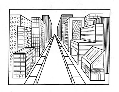
An example of linear perspective


Other techniques, such as the overlapping of shapes and the positioning of further/closer objects in the picture give the image the appearance of there being actual space within it.


'Autumn Tree Country Road' by Ruth Hounsley shows they illusion of space


In the 3D sense, it can be described as actual space as it has width, height and depth. An example is the space inside a building in architecture. This kind of space can be described as either positive or negative. Positive space can be the space that the actual art form occupies, whereas negative space is everything else- the space in and around it. An artist can manipulate these different kinds of space to articulate expression.

Form


Form is like an altered shape to create volume. Whereas shape only has mass, form has both mass and volume. It creates 3-dimensionality and contained space.


The 'Venus de Milo' shows both mass and volume

Colour


Colour is the most effective element in creating emotion. The presence of different colours stimulates different moods and contributes to the perception of an artwork by the viewer. For example, red is often used to symbolise danger, anger or sexuality (see below), while black is often associated with evil and fear.


This painting uses the colour red to represent the immorality of the woman depicted


Colour is changed by altering the hue, value or intensity. The different colours were arranged into a colour spectrum by Sir Isaac Newton in the 17th century. This wheel shows colours that are similar to one another, or opposites (complementary colours), and is the best representation of the perception and flow of colour.


Light

Like colour, light, or lack of it (dark), stimulates different feelings in people. Light is often associated with goodness, purity and clarity, whereas dark often has connotations of evil and mystery. Artists can use these perceptions to give their work a psychological dynamic. For example, 'The Ascension' by Rembrandt shows the use of light to emphasise the holiness of Jesus, leaving other areas of the painting in relative darkness.


Light is also very commonly used by artists to create the illusion of 3-Dimensionality on a 2D surface. Light, or tone, can be used here to imitate the effect of light on 3D forms and objects to create differences in light intensity (brighter nearer to light source, gets darker as you move away) and shadow.

'The Calling of St Matthew' by Caravaggio shows the difference in light intensity as you move away from the light source, and the creation of shadow


Texture

In art, texture can be either real, or the illusion of it can be created, as is the case in many paintings. An artists' manipulation of the formal elements, such as light and line, can create a specific 'texture' even on a 2-Dimensional drawing.

In this painting 'Two Girls', Tamara de Lempicka uses differences in light to give the appearance of smoothness on a 2D surface.

The texture of an artwork can be used to convey meaning as well. For example, the above painting does not use any rough textures, which contributes to a sense of purity and femininity. However, artists such as Van Gogh purposely apply their paint so that a rough texture is created on the surface. This makes the viewer think of why the artist has used this method and can contribute to the portrayal of harshness in a picture.


'Sunflowers' by Van Gogh, detail


Real, 3D texture is fundamental in the aesthetic appreciation of textiles and fashion. The textures used by a textile designer are selected especially to give the piece a certain mood or effect.


With this dress, Elie Saab's use fur can be taken to symbolise glamour and luxury


In sculpture, the texture of a piece also gives the viewer a clue as to the qualities of the material used.

Tuesday 17 November 2009

'Living and Dying' Exhibition at the British Museum

The Pharmacopoeia team and 'Cradle to Grave'

I recently went to see Pharmacopoeia (the artistic team consisting of Susie Freeman, Dr Liz Lee and David Critchley)'s 'Cradle to Grave' piece at the Living and Dying permanent exhibition at the British Museum.


One of Pharmacopoeia's most well-known works, 'Cradle to Grave' was created to illustrate the pharmaceutical life of a typical man and woman in modern Great Britain. The piece contains more than 14,000 pills for each person, which is the average amount prescribed during a lifetime.


(This shocking figure and the sheer size of the fabric is an effective way of bringing home the excessiveness of our dependence on pharmaceuticals.)


The piece is fitting with the theme and purpose of the room, which focuses on 'how diverse cultures seek to maintain health and well-being'. It explores our approach to medicinals in our search for a 'healthy' lifestyle and attempts to delay death as effectively as possible.
'Cradle to Grave' is not only made up of pills and tablets, but also of other objects such as photographs depicting personal moments of people's lives (the length of fabric advances in a time-line fashion) and other medical instruments such as syringes, an IV drip, condoms, a wine glass and a dirty ashtray. The photographs reflect personal responses to health, and the other objects represent how people can improve their well-being (through treatments etc.) or harm it (through lifestyle choices such as smoking).


Other pieces in the 'Living and Dying' exhibition show various cultures' approach to well-being and death. There were images of people with a vast quantity of medicinals, while other cultures exhibited traditional techniques and medicines, as is shown in the photos below.

Traditional Chinese medicine - ingredients to make tea, herbal ointment and pills

Tuesday 10 November 2009

Marilyn Minter

I found Marilyn Minter, artist and photographer, on the website http://www.whitewallmag.com/ , and thought that she would link in well to some of my previous sample work. My use of red lips with pills greatly resemble some of Minter's work.

While I used the lips to portray people's relationship with medicine, using Susie Freeman's concept but in my own style, Marylin Minter uses her images to create a sense of glamour with a hint of sexuality. The relationship between our two works is that they both convey a perhaps false promise of pleasure.

Wednesday 4 November 2009

T-shirts

I decided to create a t-shirt in the style of Katharine Hamnett- by writing a slogan or message in block capitals on a plain shirt. I wanted to write a phrase that made the shirt more relevant to Susie Freeman and the theme of pills that I was developing in my project. 'WHAT ARE THEY FEEDING US?' refers to the quantity of prescriptions people receive, and to how the consumption of medicinals could be harmful as it is often excessive. The props and colours I used for my model are also in keeping with my project.

While Hamnett's designs are manufactured by screen printing, a lack of resources meant I had to use a felt tip for mine. This, however, didn't create the block colour effect that manufactured t-shirts have, and also took quite a long time.

The 'trapping' technique

Susie Freeman's most popular technique is her pocket knitting, which she uses to trap many tiny, hard objects- usually pills- into fabrics. This is a collection of samples I made interpreting this 'trapping' technique through a slightly different process.


While Freeman creates tight, tiny, individual pockets for her pills, I also sowed around each one because I wanted to secure them in place and have more than one pill in each pocket.

Joana Vasconcelos

Joana Vasconcelos (born 1971) is a Portugese textile artist. She is not afraid of entering taboo areas with her art, and often creates pieces that are metaphors to present day issues. For example her most famous piece 'A Noiva' (The Bride) is a chandelier where the regular pendants are replaced by around 25,000 tampons. Vasconcelos did this to address the problem of society still being captive to patriarchy.

A Noiva, 2001

Vasconcelos' use of art as a political statement makes her relevant to my project, as does the use of knitting in her work. Her more recent works include large-scale, colourful, undulating sculptures constructed with colourful hanging cloth.

Joujoux, 2007

Other knitting work that Vasconcelos has done involves placing knitwork over objects and statues.

Happy family, 2006

Vasconcelos' uuse of knitting provides interesting design ideas for my own work.

Pills!

Inspired by Susie Freeman's use of pharmaceuticals in her work to get a point across to society, I created some photographic interpretations of people's relationship to pills.


'Veil of Tears', Wellcome Collection

I went to see one of Susie Freeman and Dr Liz Lee's works- 'Veil of Tears' (2007) at the Wellcome Collection in London.

This particular piece isn't aimed so much at raising awareness about pharmaceuticals in Britain, but considers the problem of malaria to a child in Africa.
"In five years the child will probably have had over 1000 infected mosquito bites, been tested for malaria on many occasions and taken a variety of more or less effective drug treatments. She may also have had life-threatening cerebral malaria and been treated with intravenous chloroquine." Susie Freeman and Liz Lee


'Veil of Tears' shows Freeman using different techniques and materials from her typical 'pocket knitting' and pills. Although the work still uses pills, she also adds other objects to convey a more specific image. For example, she includes small photographs of people of the area in Africa she studied, and a baby doll to highlight the illness' effect on children. This shows that she can adapt her work to fight for different causes while maintaining the essence of her art.

Tuesday 3 November 2009

Vivienne Westwood

"Westwood's designs have encompassed everything but the dull aesthetic and the cultural dumbing down she rails against."
Vivienne Westwood (born 8th April 1941 in Tintwistle, Cheshire, England) was an obvious choice for statement fashion. She attended the Harrow School of Art for one term, then moved onto Middlesex University to train as a teacher. It is clear from this that she did not have an extensive education in fashion, so her designs were mostly inspired by her own thoughts and ideas. These were kick started be Malcolm McLaren, who "lectured her on the political power of art and liberated her creative desires from their bondage in working class conformity."
From the start, Westwood's designs have always aimed to go against conventional fashion, fighting against the masses to promote individualism. She is often considered the creator of the 'punk' look of the mid 1970s, a fashion she promoted with her designs because of what it represented- a subculture making a statement in society. Her 'punk' and other eccentric designs were sold in her 430 King's Road shop, initially called 'Let it Rock' and subsequently named 'Too Fast To Live, Too Young To Die', 'SEX', 'Seditionaries' and 'World's End', as it is known today.

Westwood's political statement in fashion is to convey the importance of originality and not conforming to popular society, an ideal which has made her outrageous designs world-famous.

Some of her techniques for achieving this are themed clothing

Spring/Summer 2010 Vivienne Westwood Man Collection

and controversial designs.


On this T-shirt is printed the word 'DESTROY', a swastika and an inverted crucifix.